

Logotype Master
Our logo is the main company identifier and so its correct usage is of prime importance.
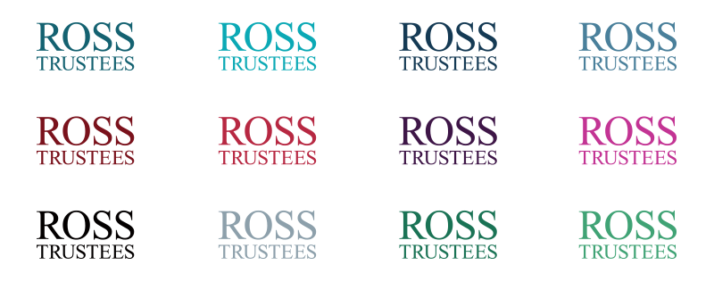
- This is the Master logotype in the primary colour Valentino.
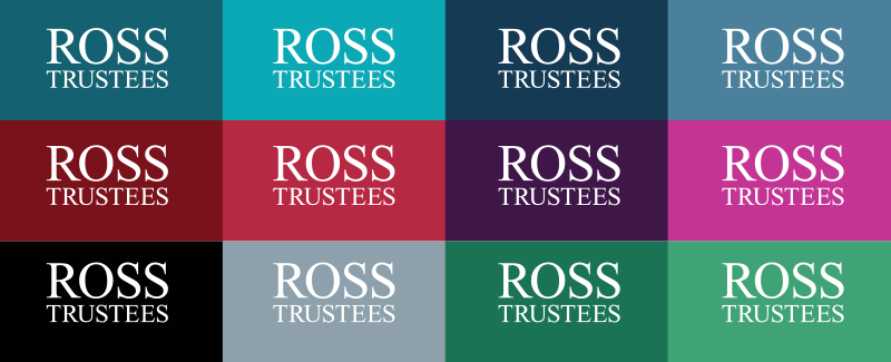
- There are two versions of the logo – the Block version and the Positive version.
- The Block version is for coloured or photographic backgrounds.
- The Positive version should only be used on white or light/plain backgrounds.
Logo Palette Colour Masters
The Positive logo can also be created in any of the palette colours. See above note regarding colour choice.
Reversed Logo Palette Colour Masters
The Block logo can be created in any of the palette colours, allowing a flexible design approach. There is no strict rule as to which colours to use and when, but the primary colour Valentino should be used on corporate core company collateral such as stationery. The other colours can be selected to add variety, to help work with other colours, or to denote different subjects or sections.
Mono Logotype
When print or colour use is limited. We would recommend using the mono (black) version of the logo.
Logotype clearance
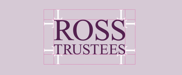
To maintain the strength of our logo – the clearance space should a minimum of the height of the Ross Trustees ‘T’ within the logo (see above).
The smallest recommended size for reproducing the logo for lithographic printing is as follows: 20mm width. Other, less refined methods of printing on more absorbent materials will not produce such good results, so the minimum size should be increased. If you have to go smaller than the recommended sizes please use the mono version of the logo.
The logo size depends on the size of the document. (to test)
As a guide the logo should be: A5 document – 38mm wide A4 document – 44mm wide A3 document – 70mm wide Online use – 158 px wide
Logotype Misuse
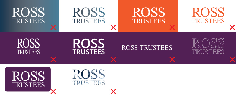
The Ross Trustees Logotype is the foundation of the brand and should only be used in the correct way. Here are some examples of what you should not do:
• Do not place the Logotype onto a gradient.
• Do not use a gradient within the fill of the Logotype.
• Do not place the Logotype on to a solid colour that is not from the colour palette.
• Do not use a colour within the fill of the Logotype that is not from the colour palette.
• Do not distort the Logotype in anyway.
• Do not recreate the Logotype in a different font.
• Do not recreate the Logotype as a non-stacked version.
• Do not outline the Logotype.
• Do not place the Logotype in a shape.
• Do not mask an image with the Logotype*.
*However the Logotype can sit on an image or illustration using a contrasting colour from the colour palette.